
Very much liked the Michael Mewborn paintings at ADA Gallery. The piece above is the one that I first stared at from outside, through the window, trying to get. Those aren't reflections on the painting, it isn't warped at all, there is no black framing... it is all just paint.
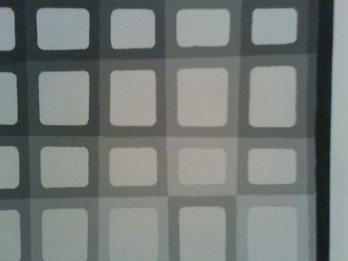
Here is a detail of the painting above, showing all the grays and the black border.
Everything at the gallery is recent work made after a thirty-year break from painting. Colors and shapes are often (always?) chosen randomly, using some kind of random number generator on the computer.
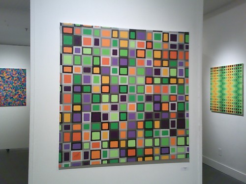
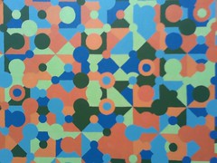
All of the other paintings are bright and colorful.
I was thinking of Stephen Westfall and Edna Andrade, two artists whose work I like A LOT.
The lines are all wobbly and shaky.. everything is painted by hand.. no tape.

Computer aided paintings.. but not really. Hard edge paintings... but not really.
I asked another artist what he thought and he said he wasn't into them because he doesn't like minimalism.. are these minimalism? So much color and busyness? Op-art, okay. I pressed him and he said that he meant he "likes work that is more visually complex". I'm so confused! What??

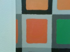
Usually don't like to see signatures on the front like this, but with these paintings... YES! Look at the signature in the little white box of the first image posted.. so cute!

11 comments:
A thirty year break from painting? Staggering.
Looking forward to checking it out. like the wobbly lines.
i can think of a number of artists who had long breaks from art-making... agnes martin, mildred greenberg, emily carr.. others. maybe i'll do a post on that.
The purple one... Swinging night club, or game-show? The one below that one looks like its colors were influenced by Picasso. I dunno, I always feel like a painting is from the Western 19-teens if it has a certain degree of flesh-tones and neutral colors in it.
The reduced pallete is definitely to his advantage, I have a dis-like for roygbiv.
i liked them all. kind of exciting... the crazy colors and energy.. the hand-madeness in the for real.
BE FOREWARNED OF NEGATIVITY
like do u go into ikea and have art orgasms over the textiled bath mats too?
like, no.
and i wasn't interested in the work of any of the other (3?) artists that were showing.
DON'T WORRY ABOUT THE NEGATIVITY! feel free to dump anytime, the differing views make the blog much more interesting.
did you see the show? what did you think about the work in the front?
Yeah, I thought the work up front needed some ...work.
I dunno. Clouds? Clouds featuring added brushstrokes on panel #2? Clouds featuring marks from an exacto blade on panel #3, an exacto blade that happened to be curiously set upon my studio desk/easel since art school?
I mean... we can pull this off in art school and people will applaud because you're technically doing something consistant, but to leave it consistantly vacuous is a disservice to both the viewer and yourself.
What's hard is that no matter how empty, there's a strongly american and popular degree of being genuinely empty. The ironic consequence is that artists are beginning to look a lot like characters in films by Wes Anderson, but even the true characters aren't genuinely this empty or one-dimensional. So when you come upon someone standing on the street saying "I make clouds." today what are you supposed to do? Give him a dollar and say "Good for you!" or do you encourage him to be something more? This is a serious question in art today.
This is the problem within relativism in the post-modern era, and the answer is CRAP-tastic.
For God's sake, look what it's done to Javier Tapia!
http://tapiajavier.com/special/special.htm
What is it that you want there to be? It is a picture not a lecture or the evening news. Is it not enough for a picture to be about the picture? Just like Michael Mewborn there does not seem to be a story or what ever. It is about the viewer lookinng at the picture and thinking about what they see. Is the problem relativism in the post-modern era? could it be that most watch MTV and want painting and art in general to be something that they can easily understand and describe to their friends with out having to think about what is before you. I think Jeffrey Majer's paintings were interesting. Some better then others like every group of paintings. The color combos were fresh and some of the works had great surface Subdlties (sp?). They were quiet in many cases but what if they were not clouds and just abstract paintings would they be good enough to get out of art school?
Virginia Nostrand Lee in the back had a nice show too, there seems like there is some story or what ever it is that relates to the post-modern era
same anonymous as the one message before
forgot to say
I also love Javiern Tapia's paintings
just to be clear - the link above is to the art of javier tapia, of chile, born 1976.... not the javier tapia that teaches at vcu.
anonymous - which javier tapia's work do you mean to say you like?
I ment the javier that was quoted in the above web address but I like javier Tapia that is the techer too.same anonymous as before
Post a Comment